Data Visualization using Pandas
Data Visualization is the representation of data in a graphical format that facilitates comprehension and provides a deeper insight into understanding the data. Data can be represented using graphs, charts, pictures, etc. Pandas is one of the most commonly used Python libraries for Data Analysis. In this article, we will focus on Data Visualization using Pandas.
Consider the following data:
| import pandas as pd sales_records = [[2001,500,20], [2002,750,15], [2003,450,18], [2004,550,25], [2005,300,12], [2006,350,15], [2007,850,21], [2008,700,10], [2009,450,24], [2010,300,14]] df = pd.DataFrame(sales_records,columns=[‘Year’,’Sales’,’Profit%’]) print(df) |
The DataFrame is:
| Year Sales Profit% 0 2001 500 20 1 2002 750 15 2 2003 450 18 3 2004 550 25 4 2005 300 12 5 2006 350 15 6 2007 850 21 7 2008 700 10 8 2009 450 24 9 2010 300 14 |
This sales_record dataset consists of information such as the sales and profit of a company over the years. Let’s plot some graphs to visualize this data more clearly.
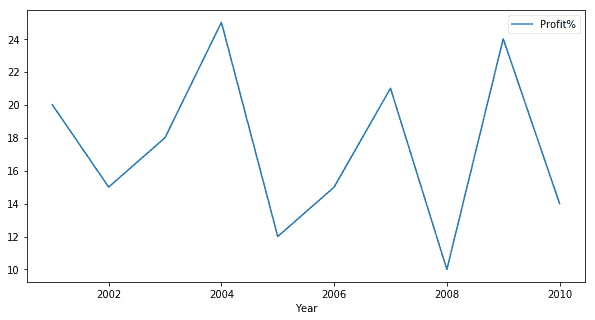
Line Plot
A line plot is useful to visualize the frequency of data along the number line. This is highly useful in the case of Time-series data. We can visualize the trend in Profit percentage of the company over the given 10 years using a line graph. The code for doing so in Pandas is:
| df.plot.line(x = ‘Year’, y =’Profit%’, figsize =(10,5)) |
Output:
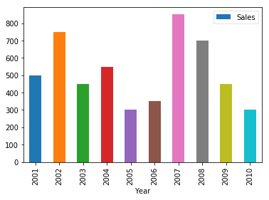
Bar Graph
Data can also be visualized using horizontal or vertical straight lines. For example, a bar graph can be used to visualize sales in various years as:
| df.plot.bar(x=’Year’, y=’Sales’) |
Output:
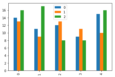
Multiple variables can also be represented on the same graph:
| df = pd.DataFrame([[14,13,16],[11,9,17],[12,13,8],[9,11,8],[15,10,16]]) df.plot.bar() |
Output:
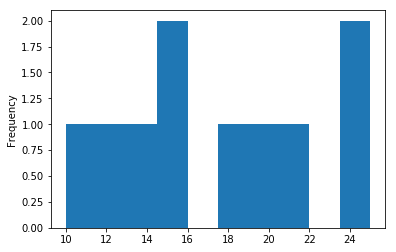
Histogram
A histogram is useful for showing distribution frequency for continuous data. For example, for the sales_record data, to view the frequency distribution of profit percentage:
| df[‘Profit%’].plot.hist() |
Output:
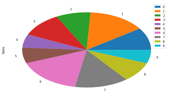
Pie Chart
We can also visualize the sales data using a Pie chart. This is useful for a quick comparison between the quantities. For example to view the sales of various indices:
| df.plot.pie(y=’Sales’, figsize=(10,6)) |
Output:
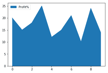
Area Plot
It is used to graphically represent quantitive areas in form of their areas. This is useful for comparisons. For example, the profit trend in the sales_record data is:
| df.plot.area(y=[‘Profit%’]) |
Output:
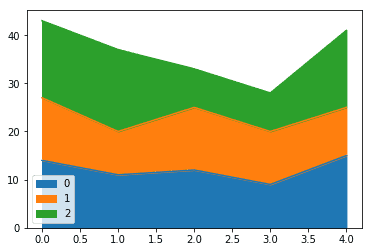
We can also view several quantities with their areas stacked on top of other, as:
| df = pd.DataFrame([[14,13,16],[11,9,17],[12,13,8],[9,11,8],[15,10,16]]) df.plot.area() |
Output:
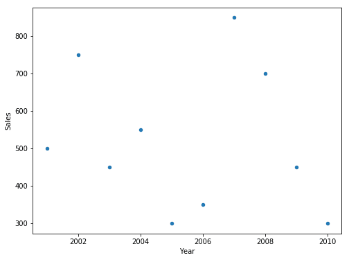
Scatter Plot
To view data in form of Scatter plots, can be done in Pandas as:
| df.plot.scatter(x=’Year’, y=’Sales’, figsize=(8,6)) |
Output:
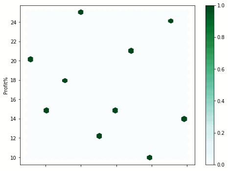
Hexagonal Plots
Plots hexagons for intersecting data points of x and y-axis. Pandas uses the hexbin() method to achieve the same. For example, for the sales_record data:
| df.plot.hexbin(x=’Year’, y=’Profit%’, gridsize=30, figsize=(8,6)) |
Output:
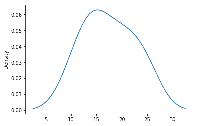
Kernel Density Estimation (KDE) Plot
This plots a smooth distribution curve for the density of the given values. For example, for the profit percentage in sales_record data:
| df[‘Profit%’].plot.kde() |
Output:
Summary
In this article, we looked at Data Visualization using Pandas. In the next article, we will focus on Data Visualization using Matplotlib.