
Data Visualization using Matplotlib
Matplotlib is the most popular Python library for Data Visualization. It is a multi-platform, 2D plotting library and supports a wide variety of Operating Systems. In this article, we will focus on Data Visualization using matplotlib.
matplotlib
We generally import matplotlib as:
| import matplotlib.pyplot as plt |
Let’s consider the following sales_records data for visualization using matplotlib:
| import numpy as np import pandas as pd import matplotlib.pyplot as plt sales_records = [[200,500,450], [700,750,550], [250,450,350], [300,550,250], [600,300,350], [300,350,150], [700,850,600], [650,700,700], [900,450,500], [400,300,200]] year = [2000,2001,2002,2003,2004,2005,2006,2007,2008,2009] df = pd.DataFrame(sales_records, columns=[‘Company1′,’Company2′,’Company3’], index=year) print(df) |
The DataFrame is:
| Company1 Company2 Company3 2000 200 500 450 2001 700 750 550 2002 250 450 350 2003 300 550 250 2004 600 300 350 2005 300 350 150 2006 700 850 600 2007 650 700 700 2008 900 450 500 2009 400 300 200 |
This sales_records dataset consists of the sales profile of three companies over the years. Let’s plot some graphs to visualize this data more clearly.
Line Plot
A line plot is useful to visualize the frequency of data along the number line. This is highly useful in the case of Time-series data. We can visualize the trend in Sales of the Company1 over the given 10 years using a line graph. The code for doing so using Matplotlib is:
| plt.plot(year, df.Company1) plt.xlabel(‘Year’) plt.ylabel(‘Sales’) plt.show() |
Output:
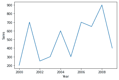
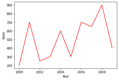
plt.xlabel() is used to label the x-axis. Similarly, plt.ylabel() labels the y-axis. plt.show() is used to display the plot. The color of the plot can also be modified. For example, to get the line plot in red color:
| plt.plot(year, df.Company1, color=’r’) plt.xlabel(‘Year’) plt.ylabel(‘Sales’) plt.show() |
Output:
We can also view the Sales trend of three companies together in the same plot, as:
| plt.plot(year, df.Company1) plt.plot(year, df.Company2) plt.plot(year, df.Company3) plt.legend([‘Company1′,’Company2′,’Company3’]) plt.xlabel(‘Year’) plt.ylabel(‘Sales’) plt.title(‘Sales of Companies’) plt.show() |
Output:
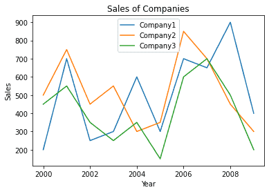
plt.title() is used to specify the title of the chart. plt.legend() displays associated legend.
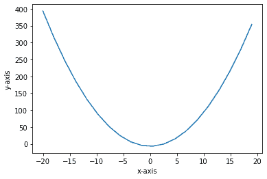
Functions can be plotted using line graphs of matplotlib, as:
| x = np.linspace(-20, 19, 20) y = (x**2) – 7 plt.plot(x, y) plt.xlabel(‘x-axis’) plt.ylabel(‘y-axis’) plt.show() |
Output:
Bar Graph
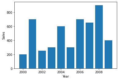
Data can also be visualized using horizontal or vertical straight lines. To do so in matplotlib:
| plt.bar(df.index,df.Company1) plt.xlabel(‘Year’) plt.ylabel(‘Sales’) plt.show() |
Output:
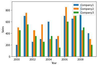
Multiple variables can also be represented on the same graph. This can be done with some modifications as:
| plt.bar(df.index + 0.0, df.Company1, width = 0.2) plt.bar(df.index + 0.2, df.Company2, width = 0.2) plt.bar(df.index + 0.4, df.Company3, width = 0.2) plt.xlabel(‘Year’) plt.ylabel(‘Sales’) plt.legend([‘Company1′,’Company2′,’Company3’]) plt.show() |
Output:
Histogram
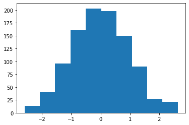
A histogram is useful for showing distribution frequency for continuous data. For example, for the generated random data, we can view the distribution, as:
| x = np.random.randn(1000) plt.hist(x) plt.show() |
Output:
Pie Chart
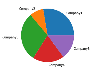
We can also visualize the sales data using a Pie chart. This is useful for a quick comparison between the quantities. Consider the example for the following data:
| company = [‘Company1′,’Company2′,’Company3′,’Company4′,’Company5’] sales = [650,200,700,450,350] plt.pie(sales, labels = company) plt.show() |
Output:
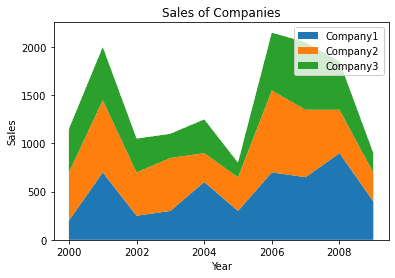
Stack Plot
We can also plot a stack plot where data of different categories are stacked together. This is an extension of the line chart and bar plot. For example, for sales_records data, the stack plot is:
| plt.stackplot(year, df.Company1, df.Company2, df.Company3) plt.legend([‘Company1′,’Company2′,’Company3’]) plt.xlabel(‘Year’) plt.ylabel(‘Sales’) plt.title(‘Sales of Companies’) plt.show() |
Output:
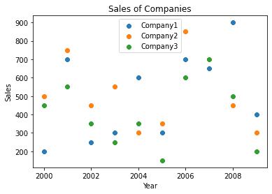
Scatter Plot
To view data in form of Scatter plots, can be done using matplotlib as:
| plt.scatter(year, df.Company1) plt.scatter(year, df.Company2) plt.scatter(year, df.Company3) plt.legend([‘Company1′,’Company2′,’Company3’]) plt.xlabel(‘Year’) plt.ylabel(‘Sales’) plt.title(‘Sales of Companies’) plt.show() |
Output:
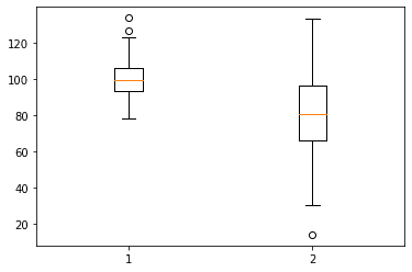
Box Plots
Box plot displays from 1st to 3rd quartile of a set of data containing the minimum, maximum, first quartile, third quartile, and median. Consider the example on the following random data:
| df = [np.random.normal(100, 10, 150), np.random.normal(80, 20, 150)] plt.boxplot(df) plt.show() |
Output:
Summary
In this article, we worked with Data Visualization using Matplotlib, its various features, and the different types of graphical representations that can be achieved through it. In the next tutorial, we will focus on visualization using Seaborn.