
Predicting Employee Churn in Python
Analyze employee churn, Why employees are leaving the company, and How to predict, who will leave the company?
In the past, most of the focus was on the ‘rates’ such as attrition rate and retention rates. HR Managers compute the previous rates try to predict future rates using data warehousing tools. These rates present the aggregate impact of churn but this is the half picture. Another approach can be the focus on individual records in addition to the aggregate.
There are lots of case studies on customer churn available. In customer churn, you can predict who and when a customer will stop buying. Employee churn is similar to customer churn. It mainly focuses on the employee rather than the customer. Here, you can predict who, and when an employee will terminate the service. Employee churn is expensive, and incremental improvements will give big results. It will help us in designing better retention plans and improving employee satisfaction.
In this tutorial, you are going to cover the following topics:
For more such tutorials, projects, and courses visit DataCamp
Employee Churn Analysis
Employee churn can be defined as a leak or departure of an intellectual asset from a company or organization. or in simple words, you can say, when employees leave the organization is known as churn. another definition can be when a member of a population leaves a population, which is known as churn.
In Research, it was found that employee churn will be affected by age, tenure, pay, job satisfaction, salary, working conditions, growth potential, and employee perceptions of fairness. Some other variables such as age, gender, ethnicity, education, and marital status, were essential factors in the prediction of employee churn. In some cases such as the employee with a niche, skills are harder to replace. It affects the ongoing work and productivity of existing employees. Acquiring new employees as a replacement has its own costs like hiring costs and training costs. Also, the new employee will take time to learn skills at a similar level of technical or business expertise knowledge as an older employee. Organizations tackle this problem by applying machine learning techniques to predict employee churn, which helps them in taking necessary actions.
The following points help you to understand, employee and customer churn in a better way:
- The business chooses the employee to hire someone while in marketing you don’t get to choose your customers.
- Employees will be the face of your company, and collectively, the employees produce everything your company does.
- Losing a customer affects revenues and brand image. acquiring new customers is difficult and costly compared to retaining existing customers. Employee churn is also painful for companies in organizations. It requires time and effort to find and train a replacement.
Employee churn has unique dynamics compared to customer churn. It helps us in designing better employee retention plans and improving employee satisfaction. Data science algorithms can predict future churn.
Exploratory Analysis
Exploratory Data Analysis is an initial process of analysis, in which you can summarize characteristics of data such as patterns, trends, outliers, and hypothesis testing using descriptive statistics and visualization.
Importing Modules
#import modules
import pandas  # for dataframes
import matplotlib.pyplot as plt # for plotting graphs
import seaborn as sns # for plotting graphs
%matplotlib inline
Loading Dataset
Let’s first load the required HR dataset using pandas’ read CSV function. You can download data from the following link: https://www.kaggle.com/liujiaqi/hr-comma-sepcsv
data=pandas.read_csv('HR_comma_sep.csv')
data.head()
Output:
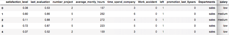
- Here, Original data is separated by a comma delimiter(“, “) in the given data set.
- You can take a closer look at the data took the help of the “head()” function of the
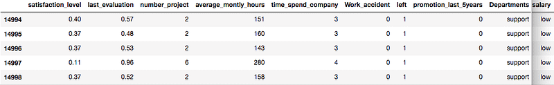
pandaslibrary which returns the first five observations. - Similarly “tail()” returns the last five observations.
data.tail()Output:
After you have loaded the dataset, you might want to know a little bit more about it. You can check attributes names and datatypes using info().
data.info()Output: <class 'pandas.core.frame.DataFrame'> RangeIndex: 14999 entries, 0 to 14998 Data columns (total 10 columns): satisfaction_level 14999 non-null float64 last_evaluation 14999 non-null float64 number_project 14999 non-null int64 average_montly_hours 14999 non-null int64 time_spend_company 14999 non-null int64 Work_accident 14999 non-null int64 left 14999 non-null int64 promotion_last_5years 14999 non-null int64 Departments 14999 non-null object salary 14999 non-null object dtypes: float64(2), int64(6), object(2) memory usage: 1.1+ MB
- This dataset has 14999 samples, and 10 attributes(6 integers, 2 float, and 2 objects).
- No variable column has null/missing values.
You can describe 10 attributes in detail:
- satisfaction_level: It is the employee satisfaction point, which ranges from 0–1.
- last_evaluation: It is evaluated performance by the employer, which also ranges from 0–1.
- number_projects: How many numbers of projects are assigned to an employee?
- average_monthly_hours: How many average numbers of hours are worked by an employee in a month?
- time_spent_company: time_spent_company means employee experience. The number of years spent by an employee in the company.
- work_accident: Whether an employee has had a work accident or not.
- promotion_last_5years: Whether an employee has had a promotion in the last 5 years or not.
- sales: Employee’s working department/division.
- Salary: Salary level of the employee such as low, medium, and high.
- left: Whether the employee has left the company or not.
Let’s Jump into Data Insights
In the given dataset, you have two types of employees one who stayed and another who left the company. So, you can divide data into two groups and compare their characteristics. Here, you can find the average of both the groups using groupby() and mean() function.
left = data.groupby('left')
left.mean()
Output:
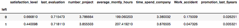
Here you can interpret, Employees who left the company had low satisfaction levels, low promotion rates, low salaries, and worked more compared to those who stayed there.
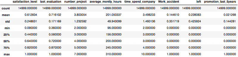
The describe() function in pandas is very handy in getting various summary statistics. This function returns the count, mean, standard deviation, minimum and maximum values, and the quantiles of the data.
data.describe()Output:
Data Visualization
Left Employee
Let’s check how many employees were left.
Here, you can plot a bar graph using Matplotlib. the bar graph is suitable for showing discrete variable counts.
left_count=data.groupby('left').count()
plt.bar(left_count.index.values, left_count['satisfaction_level'])
plt.xlabel('Employees Left Company')
plt.ylabel('Number of Employees')
plt.show()
Output:

data.left.value_counts()Output: 0 11428 1 3571 Name: left, dtype: int64
Here, you can see out of 15000 approx 3571 were left and 11428 stayed. The no of employees left is 23 % of the total employment.
Number of Projects
Similarly, you can also plot a bar graph to count the number of employees deployed on How many projects?
num_projects=data.groupby('number_project').count()
plt.bar(num_projects.index.values, num_projects['satisfaction_level'])
plt.xlabel('Number of Projects')
plt.ylabel('Number of Employees')
plt.show()
Output:
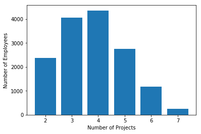
- Most of the employee is doing the project from 3–5.
Time Spent in Company
Similarly, you can also plot the bar graph to count the number of employees has on How much experience?
time_spent=data.groupby('time_spend_company').count()
plt.bar(time_spent.index.values, time_spent['satisfaction_level'])
plt.xlabel('Number of Years Spend in Company')
plt.ylabel('Number of Employees')
plt.show()
Output:
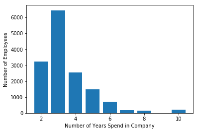
Most of the employee experience is between 2–4 years. Also, there is a huge gap between 3 years and 4 years of experienced employees.
Subplots using Seaborn
This is how you can analyze features one by one but it will be time-consuming. The better option is here to use the Seaborn library and plot all the graphs in a single run using subplots.
features=['number_project','time_spend_company','Work_accident','left', 'promotion_last_5years','sales','salary']
fig=plt.subplots(figsize=(10,15))
for i, j in enumerate(features):
     plt.subplot(4, 2, i+1)
     plt.subplots_adjust(hspace = 1.0)
     sns.countplot(x=j,data = data)
     plt.xticks(rotation=90)
     plt.title("No. of employee")
Output:
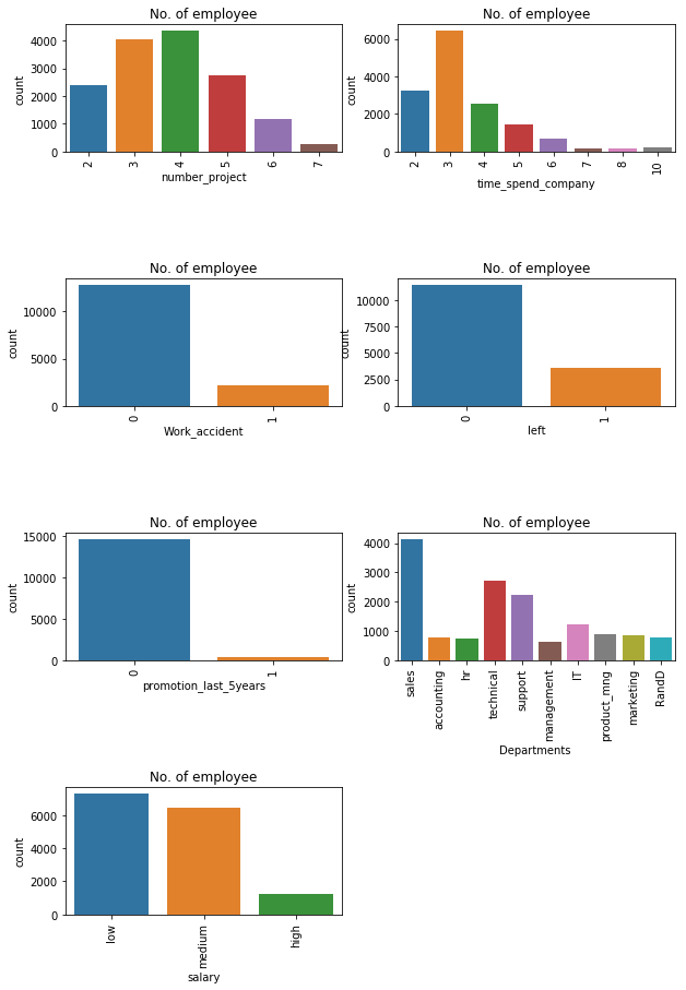
You can observe the following points in the above visualization:
- Most of the employee is doing the project from 3–5.
- There is a huge drop between 3 years and 4 years of experienced employees.
- The no of employees left is 23 % of the total employment.
- A very less number of employees get a promotion in the last 5 years.
- The sales department is having a maximum no.of employees followed by technical and support
- Most of the employees are getting a salary either medium or low.
fig=plt.subplots(figsize=(10,15))
for i, j in enumerate(features):
     plt.subplot(4, 2, i+1)
     plt.subplots_adjust(hspace = 1.0)
     sns.countplot(x=j,data = data, hue='left')
     plt.xticks(rotation=90)
     plt.title("No. of employee")
Output:

You can observe the following points in the above visualization:
- Those employees who have a number of projects more than 5 were left the company.
- Employees who have done 6 and 7 projects, left the company it seems to like that they were overloaded with work.
- Employees with five-year experience are leaving more because of no promotions in the last 5 years and more than 6 years of experience is not leaving because of affection with the company.
- Those who promotion in the last 5 years, didn’t leave i.e All those who left didn’t get the promotion in the last 5 years.
Data Analysis and Visualization Summary:
The following features are most influencing a person to leave the company:
- Promotions: Employees are far more likely to quit their job if they haven’t received a promotion in the last 5 years.
- Time with Company: Here, The three-year mark looks like a time to be a crucial point in an employee’s career. most of them quit their job around the three-year mark. Another important point is the 6-year point, where the employee is very unlikely to leave.
- Number Of Projects: Employee engagement is another critical factor to influence the employee to leave the company. Employees with 3–5 projects are less likely to leave the company. The employee with fewer and more projects are likely to leave.
- Salary: Most of the employees quit among the mid or low-salary groups.
Cluster analysis:
Let’s find out the groups of employees who left. You can observe that the most important factor for any employee to stay or leave is satisfaction and performance in the company. so let’s bunch them into groups of people using cluster analysis.
#import module
from sklearn.cluster import KMeans

# Filter data
left_emp =  data[['satisfaction_level', 'last_evaluation']][data.left == 1]

# Create groups using K-means clustering.
kmeans = KMeans(n_clusters = 3, random_state = 0).fit(left_emp)

# Add new column "label" annd assign cluster labels.
left_emp['label'] = kmeans.labels_

# Draw scatter plot
plt.scatter(left_emp['satisfaction_level'], left_emp['last_evaluation'], c=left_emp['label'],cmap='Accent')
plt.xlabel('Satisfaction Level')
plt.ylabel('Last Evaluation')
plt.title('3 Clusters of employees who left')
plt.show()
Output:
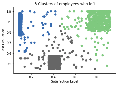
Here, Employees who left the company can be grouped into 3 types of employees:
- High Satisfaction and High Evaluation(Shaded by green color in the graph), you can also call them Winners.
- Low Satisfaction and High Evaluation(Shaded by blue color(Shaded by green color in the graph), you can also call them Frustrated.
- Moderate Satisfaction and moderate Evaluation (Shaded by grey color in the graph), you can also call them ‘Bad match’
Building prediction model
Pre-Processing Data
Lots of machine learning algorithms require numerical input data, so you need to represent categorical columns in a numerical column.
In order to encode this data, you could map each value to a number. e.g. Salary column’s value can be represented as low:0, medium:1, and high:2.
This process is known as label encoding, and sklearn conveniently will do this for you using LabelEncoder.
# Import LabelEncoder
from sklearn import preprocessing

# Creating labelEncoder
le = preprocessing.LabelEncoder()

# Converting string labels into numbers.
data['salary']=le.fit_transform(data['salary'])
data['sales']=le.fit_transform(data['sales'])
Here, you imported the preprocessing module and created the Label Encoder object. Using this LabelEncoder object you fit and transform the “salary” and “Departments “columns into the numeric column.
Split train and test set
To understand model performance, dividing the dataset into a training set and a test set is a good strategy.
Let’s split the dataset by using the function train_test_split(). you need to pass basically 3 parameters features, target, and test_set size. Additionally, you can use random_state in order to get the same kind of train and test set.
# Spliting data into Feature and
X=data[['satisfaction_level', 'last_evaluation', 'number_project', 'average_montly_hours', 'time_spend_company', 'Work_accident', 'promotion_last_5years', 'sales', 'salary']]
y=data['left']
# Import train_test_split function
from sklearn.model_selection import train_test_split

# Split dataset into training set and test set
X_train, X_test, y_train, y_test = train_test_split(X, y, test_size=0.3, random_state=42)  # 70% training and 30% test
Here, the Dataset is broken into two parts in the ratio of 70:30. It means 70% of the data will be used for model training and 30% for model testing.
Model Building
Let’s build an employee churn prediction model.
Here, you are going to predict churn using Gradient Boosting Classifier. YOu can learn more about ensemble techniques in this article.
First, import the GradientBoostingClassifier module and create the Gradient Boosting classifier object using GradientBoostingClassifier() function.
Then, fit your model on the train set using fit() and perform prediction on the test set using predict().
#Import Gradient Boosting Classifier model
from sklearn.ensemble import GradientBoostingClassifier

# Create Gradient Boosting Classifier
gb = GradientBoostingClassifier()

# Train the model using the training sets
gb.fit(X_train, y_train)

# Predict the response for test dataset
y_pred = gb.predict(X_test)
Evaluating model performance
# Import scikit-learn metrics module for accuracy calculation
from sklearn import metrics

# Model Accuracy, how often is the classifier correct?
print("Accuracy:",metrics.accuracy_score(y_test, y_pred))

# Model Precision
print("Precision:",metrics.precision_score(y_test, y_pred))

# Model Recall
print("Recall:",metrics.recall_score(y_test, y_pred))
Output: Accuracy: 0.971555555556 Precision: 0.958252427184 Recall: 0.920708955224
Well, you got a classification rate of 97%, considered as good accuracy.
Precision: Precision is about being precise i.e. How precise your model is. In other words, you can say, when a model makes a prediction, how often it is correct. In your prediction case, when your Gradient Boosting model predicted an employee is going to leave, that employee actually left 95% time.
Recall: If there is an employee who actually left present in the test set and your Gradient Boosting model is able to identify it 92% of the time.
Conclusion
Congratulations, you have made it to the end of this tutorial!
In this tutorial, you have learned What is Employee Churn?, How it is different from customer churn, Exploratory data analysis and visualization of employee churn dataset using matplotlib and seaborn, model building and evaluation using the python scikit-learn package.
I look forward to hearing any feedback or questions. you can ask the question by leaving a comment and I will try my best to answer it.
For more such tutorials, projects, and courses visit DataCamp
Originally published at https://www.datacamp.com/community/tutorials/predicting-employee-churn-python
Reach out to me on Linkedin: https://www.linkedin.com/in/avinash-navlani/