
Data Visualization using Seaborn
Seaborn is a Python library built on top of matplotlib. Seaborn is basically a Data Visualization library with a wide variety of wonderful styles and features for statistical plotting. In this article, we will focus on Data Visualization using Seaborn.
Installation and environment setup
Seaborn library has some mandatory dependencies which need to be installed first. They are:
- NumPy (>= 1.9.3)
- SciPy (>= 0.14.0)
- Pandas (>= 0.15.2)
- Matplotlib (>= 1.4.3)
Seaborn can be installed using any of the two methods given below:
- Using Anaconda
| conda install seaborn |
- Using Pip
| pip install seaborn |
To get started, we import the dependencies and the seaborn package, as:
| import numpy as np import pandas as pd import matplotlib.pyplot as plt import seaborn as sns |
Consider the following data:
| sales_records = [[200,500,450], [700,750,550], [250,450,350], [300,550,250], [600,300,350], [300,350,150], [700,850,600], [650,700,700], [900,450,500], [400,300,200]] year = [2000,2001,2002,2003,2004,2005,2006,2007,2008,2009] df = pd.DataFrame(sales_records, columns=[‘Company1′,’Company2′,’Company3’], index=year) print(df) |
The DataFrame is:
| Company1 Company2 Company3 2000 200 500 450 2001 700 750 550 2002 250 450 350 2003 300 550 250 2004 600 300 350 2005 300 350 150 2006 700 850 600 2007 650 700 700 2008 900 450 500 2009 400 300 200 |
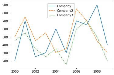
This sales_record dataset consists of information such as the sales of three companies over the years. Let’s plot some graphs to visualize this data more clearly.
Line Plot
A line plot is useful to visualize the frequency of data along the number line. We can visualize the sales trend of the companies over the given 10 years using a line graph. The code for doing so in Seaborn is:
| sns.lineplot(data=df) |
Output:
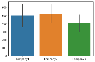
Bar Graph
Data can also be visualized using horizontal or vertical straight lines. In Seaborn, barplot() function works on a full dataset and plots the mean of the categories, as:
| sns.barplot(data=df) |
Output:
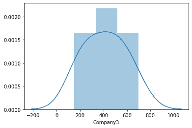
Plotting Distribution of the Data
Seaborn can also be used to plot the distribution of data using Histograms, KDE plots, or joint distributions. The function for plotting the univariate distribution of data using Seaborn is distplot(). This function depicts both the histogram and the KDE function for the data. For example, using distplot() for visualizing the distribution of sales for Company3:
| sns.distplot(df.Company3) |
Output:
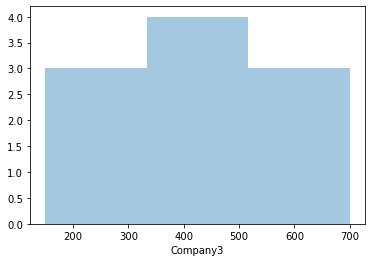
To view only the histogram, we can set “kde=False”, as:
| sns.distplot(df.Company3, kde=False) |
Output:
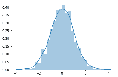
The use of these plots can be visualized more properly in a distributed data like:
| df = pd.DataFrame(np.random.randn(1000)) sns.distplot(df) |
Output:
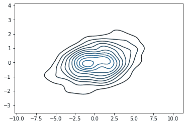
We can also view KDE plots separately using the kdeplot() function. Let’s visualize this for the following multivariate data:
| df = pd.DataFrame(np.random.multivariate_normal([0, 0], [[7, 1], [1, 1]], size=500), columns=[‘x’, ‘y’]) sns.kdeplot(df) |
Output:
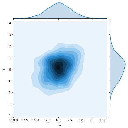
We can also plot the joint distribution using seaborn. Consider the following examples:
| df = pd.DataFrame(np.random.multivariate_normal([0, 0], [[7, 1], [1, 1]], size=500), columns=[‘x’, ‘y’]) sns.jointplot(x=df.x, y=df.y, kind=’kde’) |
Output:
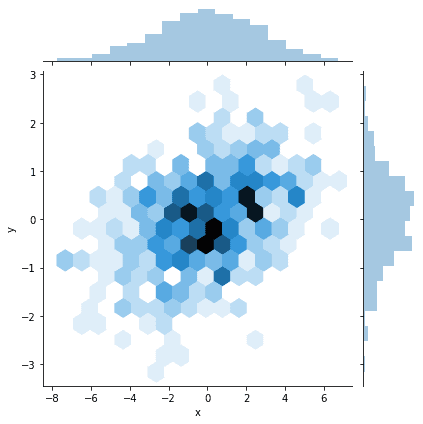
Hexplot can also be plotted using the jointplot() function, by changing kind=‘hex’, as:
| df = pd.DataFrame(np.random.multivariate_normal([0, 0], [[7, 1], [1, 1]], size=500), columns=[‘x’, ‘y’]) sns.jointplot(x=df.x, y=df.y, kind=’hex’) |
Output:
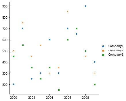
Scatter Plot
To view data in form of Scatter plots, can be done in using the relplot() function of Seaborn. Consider it on the sales_record data:
| sns.relplot(data=df) |
Output:
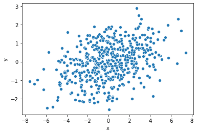
We can do the same using the scatterplot() function of Seaborn. Let’s view it on some random multivariate data:
| df = pd.DataFrame(np.random.multivariate_normal([0, 0], [[7, 1], [1, 1]], size=500), columns=[‘x’, ‘y’]) sns.scatterplot(x=’x’, y=’y’, data=df) |
Output:
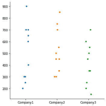
Plotting Categorical Data in Seaborn
The sales_records data is a good example to visualize categorical data, where we are viewing data of three different companies. With seaborn, this is done using the catplot() function. For example:
| sns.catplot(data=df) |
Output:
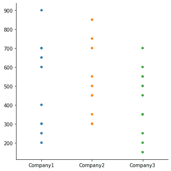
Using seaborn, we can view categorical data in different ways such as Jitter plot, Hue plot, Point plot, Box plot, etc. Jitter is the deviation from the true value. In the above plot, we can set jitter as False, which will give vales in a straight line rather than scattered:
| sns.catplot(data=df, jitter=False) |
Output:
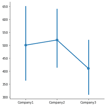
Using a point plot, we can point out the estimate value and confidence interval. We can do so for the original sales_records data for three companies, as:
| sns.catplot( data=df, kind=”point”) |
Output:
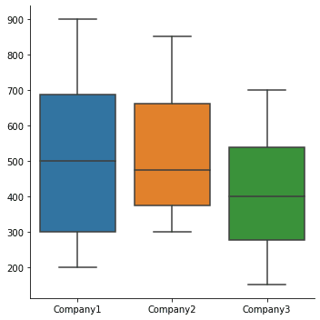
Box plot shows three quartile values of the distribution. For the sales_record data:
| sns.catplot(data=df, kind=”box”) |
Output:
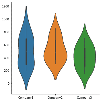
The data can also be represented using a violin plot, as:
| sns.catplot(data=df, kind=”violin”) |
Output:
If there we want to introduce another dimension such that its categories are visualized in different colors, then we set that feature in the hue parameter. Consider the following code:
| sales = [[200,500,’A’], [700,750,’A’], [250,450,’B’], [300,550,’A’], [600,300,’B’], [300,350,’A’], [700,850,’B’], [650,700,’A’], [900,450,’B’], [400,300,’A’]] years = [2000,2001,2002,2003,2004,2005,2006,2007,2008,2009] df = pd.DataFrame(sales, columns=[‘Company1′,’Company2′,’Type’], index=years) print(df) sns.catplot(x=years, y=’Company2′, data=df, hue=’Type’) |
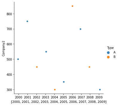
Here, Type is of A and B, which can be represented using hue as:
Summary
In this article, we looked at Data Visualization using Seaborn. We have seen various plots such as line plot, bar plot, histogram, distribution plot, joint plot, scatter plot, cat plot and box plot.