
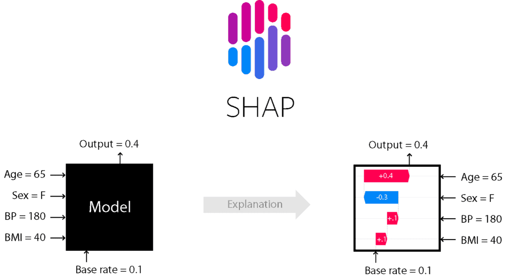
Explain Machine Learning Model using SHAP
Learn SHAP tool to understand feature contribution in prediction model.
Most of the Machine Learning and Neural Network models are difficult to interpret. Generally, Those models are a BlackBox that makes it hard to understand, explain, and interpret. Data scientists always focus only on output performance of a model but not on model interpretabiility and explainability. Data Scientists need certain tools to understand and explain the model for an intuitive understanding of the machine learning model. We have one such tool SHAP that explain how Your Machine Learning Model Works. SHAP(SHapley Additive exPlanations) provides the very useful for model explainability using simple plots such as summary and force plots.
In this article, we’re going to explain model explainability using SHAP package in python.
What is SHAP?
SHAP stands for SHapley Additive exPlanations. It is based on a game theoretic approach and explains the output of any machine learning model using visualization tools.
SHAP Characteristics
- It is mainly used for explaining the predictions of any machine learning model by computing the contribution of features into the prediction model.
- It is a combination of various tools such as lime, SHAPely sampling values, DeepLift, QII, and other tools.
- It calculates the consistent outcome as the sum of each feature contribution.
- It does not evaluate the quality of the prediction model.
- It summary plots provide a useful overview of the model.
- The main disadvantage is that its computing time is high.
SHAP Installation
SHAP can be installed from either PyPI:
pip install shapWe can also install using conda-forge:
conda install -c conda-forge shapLoading Dataset
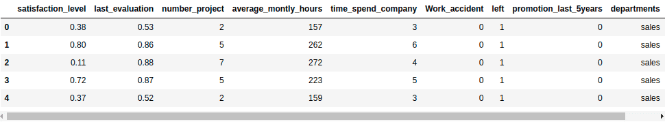
Let’s first load the required HR dataset using pandas’ read CSV function. You can download data from the following link: https://www.kaggle.com/liujiaqi/hr-comma-sepcsv
import pandas  # for dataframes
import matplotlib.pyplot as plt # for plotting graphs
import seaborn as sns # for plotting graphs

data=pandas.read_csv('HR_comma_sep.csv')

data.head()
Output:
Prepare the Data
Lots of machine learning algorithms require numerical input data, so you need to represent categorical columns in a numerical column.
In order to encode this data, you could map each value to a number. e.g. Salary column’s value can be represented as low:0, medium:1, and high:2.
This process is known as label encoding, and sklearn conveniently will do this for you using LabelEncoder.
# Import LabelEncoder
from sklearn import preprocessing

# Creating labelEncoder
le = preprocessing.LabelEncoder()

# Converting string labels into numbers.
data['salary']=le.fit_transform(data['salary'])
data['departments']=le.fit_transform(data['departments'])
Here, you imported the preprocessing module and created the Label Encoder object. Using this LabelEncoder object you fit and transform the “salary” and “Departments“ column into the numeric column.
Build Model
First we split the dataset and then we build the model.
Let’s split dataset by using function train_test_split(). you need to pass basically 3 parameters features, target, and test_set size. Additionally, you can use random_state in order to get the same kind of train and test set.
# Spliting data into Feature and

X = data[['satisfaction_level', 'last_evaluation', 'number_project',
        'average_montly_hours', 'time_spend_company', 'Work_accident',
        'promotion_last_5years', 'departments' ,'salary']]
y = data['left']

# Import train_test_split function
from sklearn.model_selection import train_test_split

# Split dataset into training set and test set
X_train, X_test, y_train, y_test = train_test_split(X, y, test_size=0.3, random_state=42)  # 70% training and 30% test
Let’s build an employee churn prediction model.
Here, you are going to predict churn using Random Forest Classifier.
#Import Random Forest Classifier model
from sklearn.ensemble import RandomForestClassifier

# Create Random Forest Classifier
rf = RandomForestClassifier()

# Train the model using the training sets
rf.fit(X_train, y_train)

# Predict the response for test dataset
y_pred = rf.predict(X_test)
Evaluate Model
# Import sklearn metrics
from sklearn import metrics

# Model Accuracy, how often is the classifier correct?
print("Accuracy:",metrics.accuracy_score(y_test, y_pred))

# Model Precision
print("Precision:",metrics.precision_score(y_test, y_pred))

# Model Recall
print("Recall:",metrics.recall_score(y_test, y_pred))
Output:
Accuracy: 0.9871111111111112
Precision: 0.9912790697674418
Recall: 0.9542910447761194
Well, you got a classification rate of 98%, considered as good accuracy.
Model Interpretability
Now, we’ll move to the model interpretability using SHAP. First we will calculate the SHAP values.
In order to calculate the SHAP values, we need to create TreeExplainer object and compute the SHAP values for a sample or the full dataset:
# Create object that can calculate shap values
explainer = shap.TreeExplainer(rf)

# Calculate Shap values
shap_values = explainer.shap_values(X_test)
Lets build the summary plot using summary_plot() method.
# Create summary_plot
shap.summary_plot(shap_values, X_test)
Output:
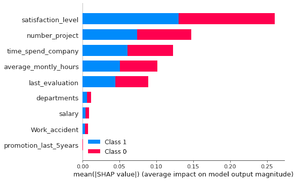
In the above example, feature’s importance is arranged in descending order from the highest to the lowest. This order is showing the impact of features on prediction. It shows the absolute SHAP value so it doesn’t matter predictions are affected positive or negative. This plot is also showing the
Lets plot the force plot to see the impact of features on predictions by observation. Force plots shows the features contribution to the model’s prediction for a specific observation.
shap.initjs()
shap.force_plot(explainer.expected_value[1], shap_values[1], X_test)
Output:
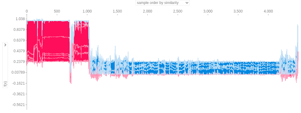
This plot is the generalised plot. Now I am selecting the last_evaluation(or employee performance) as feature on both the axis.
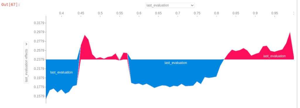
Above plot is showing the SHAP value for last_evaluation (or employee performance). When employee’s performance is lower than 0.43 employee is leaving or company is firing them. When employee’s performance score is between 0.57 to 0.82 than employee is leaving the firm.
Summary
Congratulations, you have made it to the end of this tutorial!
I hope this article will help you in model interpretability and explainability. This one of the most important tool for any data scientist to dig down into the model.
In this tutorial, you have learned about how to interpret the model and understand feature contribution. Don’t stop here! I recommend you try different classifiers on different datasets. You can also try SHAP on text and image datasets. In upcoming lecture we will focus on text data, image data and deep learning based models interpretability.